QuillTrace has social networking features that allow readers to connect, share reading experiences and interact with authors in a safe, organic way. Through QuillTrace authors can upload and sell their content, readers can discover it through a combination of digital word-of-mouth and a sophisticated recommendation engine, and communities can grow and thrive around shared genres and fandoms.
Quilltrace
ui design
webapp
design system
mobile
desktop
An online platform when readers and authors connect.
Design process
Starting from the project idea, I defined the functionalities by prioritizing them. This approach allowed me to develop a well-defined architecture and user flows, crucial to ensuring a consistent and intuitive browsing experience within the platform. Subsequently, I mapped out the styles and components, giving rise to a scalable and uniform design system. In selecting the primary and secondary colours, I conducted thorough research with particular attention to accessibility, opting for two colours that comply with WCAG AA standards.
 Functional analysis
 Architecture
 User flow
 Wireframes
 Styles
 Components
 Mockups
 Prototype
Functionalities
 Authors and Users
Users who register on the platform will have the opportunity to associate an author account with their reader account, following a specific creation and onboarding flow within the platform. Although the two types of users are related, they operate independently, and it’s not possible to trace back from the author to their corresponding user.
 Upload and Buy
Authors have the opportunity to upload their own works to the platform, allowing them to be put up for sale to the public. At the same time, users can explore this wide range of works and purchase those that reflect their interests and preferences. Once the purchase is made, the work becomes a permanent part of the user’s personal library, offering continuous and convenient access to reading and enjoying the content.
 Discover and Follow
Users will be able to use the search function to find authors or works they already know, or discover new ones that match their interests or previous searches. Additionally, they will have the opportunity to follow the pages of authors they are interested in, allowing them to stay constantly updated on the latest news and publications. This feature promotes direct interaction between authors and their readers, creating a dynamic and engaging environment within the platform.
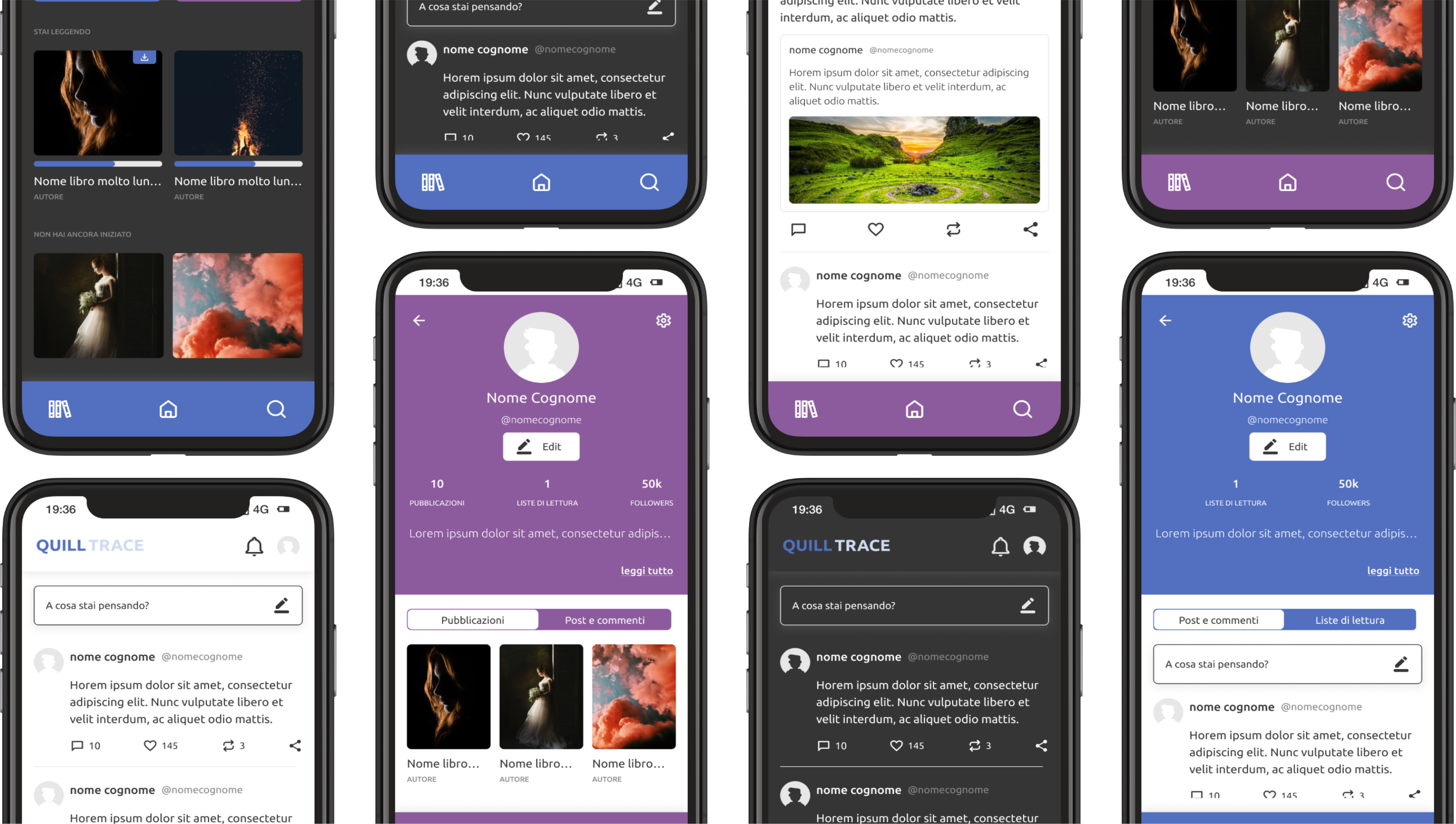
 Light and Dark
The implementation of a dark version of the platform was made possible thanks to the accurate mapping of colours, which allowed the selection of suitable chromatic shades to enhance the visual experience of users. This alternative version of the platform not only offers an aesthetically pleasing solution but also proves to be particularly advantageous for users who prefer a less luminous viewing mode, thus ensuring greater comfort and customization of the user experience for a wide range of users.
Styles
Colour mapping
The definition of ‘primitive’ colours was a crucial step in the design and development process of the design system. I identified primary, secondary, and system tones, each with a well-defined role in the overall visual appearance and user experience, paying particular attention to colour accessibility to ensure an inclusive experience for all users.
In this context, both primary and secondary tones are equally important and were used to distinguish the interface intended for the two different types of users: reader and author. System colours are those used to indicate states, actions, or feedback to the user within the interface.
Once the primitive colours were defined, I used them as a basis for setting semantic tokens (backgrounds, text, borders, and other visual elements). This approach allowed me to ensure consistency and visual coherence throughout the design system, providing a common visual language that is fundamental to the development phase. Additionally, the tokens proved essential for effectively mapping colour changes in dark mode, ensuring an optimal user experience in all viewing conditions.


Grid & Sizing
I defined breakpoints and grids for different types of devices to ensure the optimal adaptation of the site to various screen needs and sizes. I developed a library of spaces and dimensions, adopting the rule based on multiples of 4. This approach allowed me to uniformly control padding, margin, and other spacings, ensuring consistency and precision in the overall design.
Large desktop screens
1440px <
12 Columns
Margin 60px
Gutter 24px - Stretch
Small desktop screens
< 1440px
12 Columns
Margin 60px
Gutter 24px - Stretch
Tablet devices
< 1024px
12 Columns
Margin 40px
Gutter 20px - Stretch
Mobile devices (landscape)
< 768px | < 480px
4 Columns
Margin 16px
Gutter 24px - Stretch
Typography
After careful consideration, it emerged that the ‘Ubuntu’ font was the optimal choice, thanks to its combination of simplicity and contemporaneity. Its visual clarity makes it easily readable even at reduced sizes, ensuring a pleasant and accessible reading experience for all users. Four weights of the font were selected: bold, medium, regular, and light. This choice visually differentiates titles, texts, and emphasis elements, thus contributing to a better visual organization of the content.

Components
After defining the design guidelines, I focused on creating the design system following the atomic design approach.
First, I defined the most basic elements, such as buttons and inputs, and then progressively built increasingly complex and articulated components.
At every stage of the interface design process, I diligently checked the accuracy of the colour mapping for the dark mode, ensuring that all components were fully usable and consistent during the transition between light and dark modes.