Pazienti.it

ux/ui design website design system mobile desktop

A digital platform focused on health and wellness

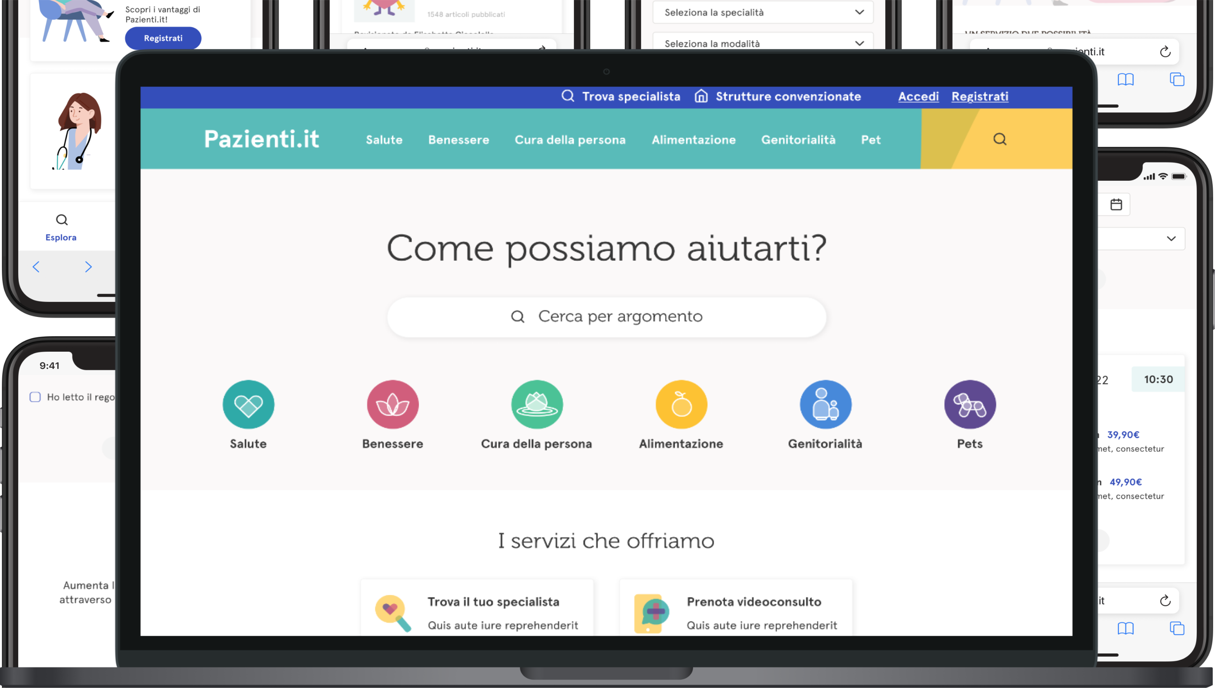
Following the covid pandemic, Pazienti.it introduced new services such as video-conference visits, shortening the distance between doctors and patients. They also decided to extend their target market by adding animals to the equation.

The introduction of new services and the change of paradigm highlighted the need for re-organisation and re-styling of the portal, creating a new digital identity that not only works on its own but is also scalable to the various aspects that make up the brand.

Design process

Functionalities

User and Doctor

Two landing pages were created, one dedicated to the registration of general users and the other reserved for doctors. Each of these pages presents the specific benefits and features related to the corresponding user type and was designed with the possibility of being integrated into an advertising campaign in mind.

More than one soul

From the beginning, it was evident that Pazienti.it wanted to fully express its diversity and richness of content. To achieve this goal, a website was designed that, while maintaining consistency and solidity in its basic structure, adapts with colors and content to various facets: health, wellness, personal care, nutrition, parenting, and pets.

Video Visit

The video visit allows users to easily and quickly book a 15 or 20-minute online appointment with a specialist of their choice, based on reviews, geographical proximity, and other relevant criteria. We designed a dedicated landing page that clearly presents the features and procedures for booking, with the aim of making the service accessible even to users who arrive on the page through an advertising campaign.

Magazine

Pazienti.it is committed to providing targeted content and information to help users improve their personal well-being or that of their loved ones. This goal is achieved through a structure based on vertical blogs, organized both by macro categories and more specific subcategories, in order to offer a clear and focused browsing experience.

Styles

Color mapping

The definition of ‘primitive’ colors was a crucial step in our design and development process of the design system. We identified the primary, secondary, and system tones, each with a well-defined role in the overall visual appearance and user experience.

Primary tones are the fundamental colors that form the basis of the entire palette. In this case, the category colors serve as secondary tones; they are used to differentiate specific sections of the design and to add visual accents. System colors are those used to indicate states, actions, or feedback to the user within the interface.

Once the primitive colors were defined, we used them as the basis for setting semantic tokens, such as backgrounds, text, borders, and other visual elements. This approach allows us to ensure consistency and visual cohesion throughout the design system, providing a common visual language that is essential for the development phase.

Project color palette

Grid definition

We defined the breakpoints and grids for different types of devices to ensure that the site behaves and adapts optimally to various needs and screen sizes.

Large desktop screens

1440px <

12 Columns Margin 60px Gutter 24px - Stretch

Small desktop screens

< 1440px

12 Columns Margin 60px Gutter 24px - Stretch

Tablet devices

< 1024px

12 Columns Margin 40px Gutter 20px - Stretch

Mobile devices (landscape)

< 768px | < 480px

4 Columns Margin 16px Gutter 24px - Stretch

Typography

In line with the brand style, we selected two fonts: Museo and Apercu Pro.

Museo was preferred for titles and subtitles, while Apercu Pro was chosen for the main body text.

We assigned size labels to each text style, thus establishing a shared and consistent language.

Font sizes and weights

Components

After defining the design guidelines, we focused on creating the design system following an atomic design approach.

We started with the definition of the most basic elements, such as buttons and inputs, and then progressively built increasingly complex and detailed components.

Design system components screenshot
Pazienti.it