The challenge
When I joined the team, our products had strong individual designs but lacked a unified visual foundation. The different software employed various styles, and components were inconsistent across screens, with accessibility not always guaranteed. I saw an opportunity - not just to clean things up visually, but to build a design system that would empower the entire product team: a library that felt alive, flexible, and true to our brand identity.
Step 1 - Laying the Foundations
Everything started with the basics. I wanted a strong foundation before jumping into components, so I focused on colour, typography, grid, and spacing; the DNA of our design language.
Alignment with Brand
I worked closely with our Brand team to make sure the product’s look and feel reflected our visual identity. This step was essential to create a system that respected our brand while being adaptable for digital experiences.
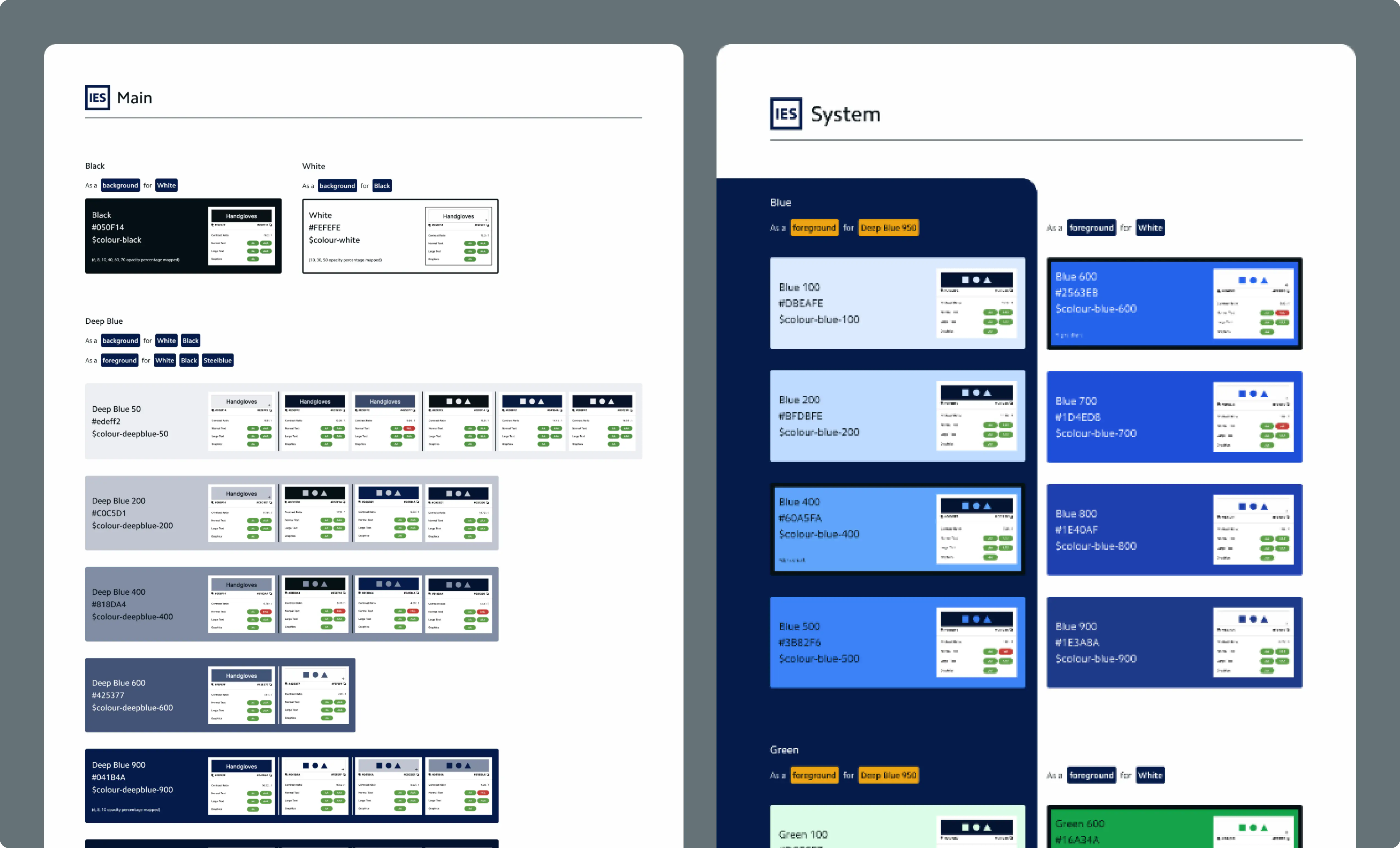
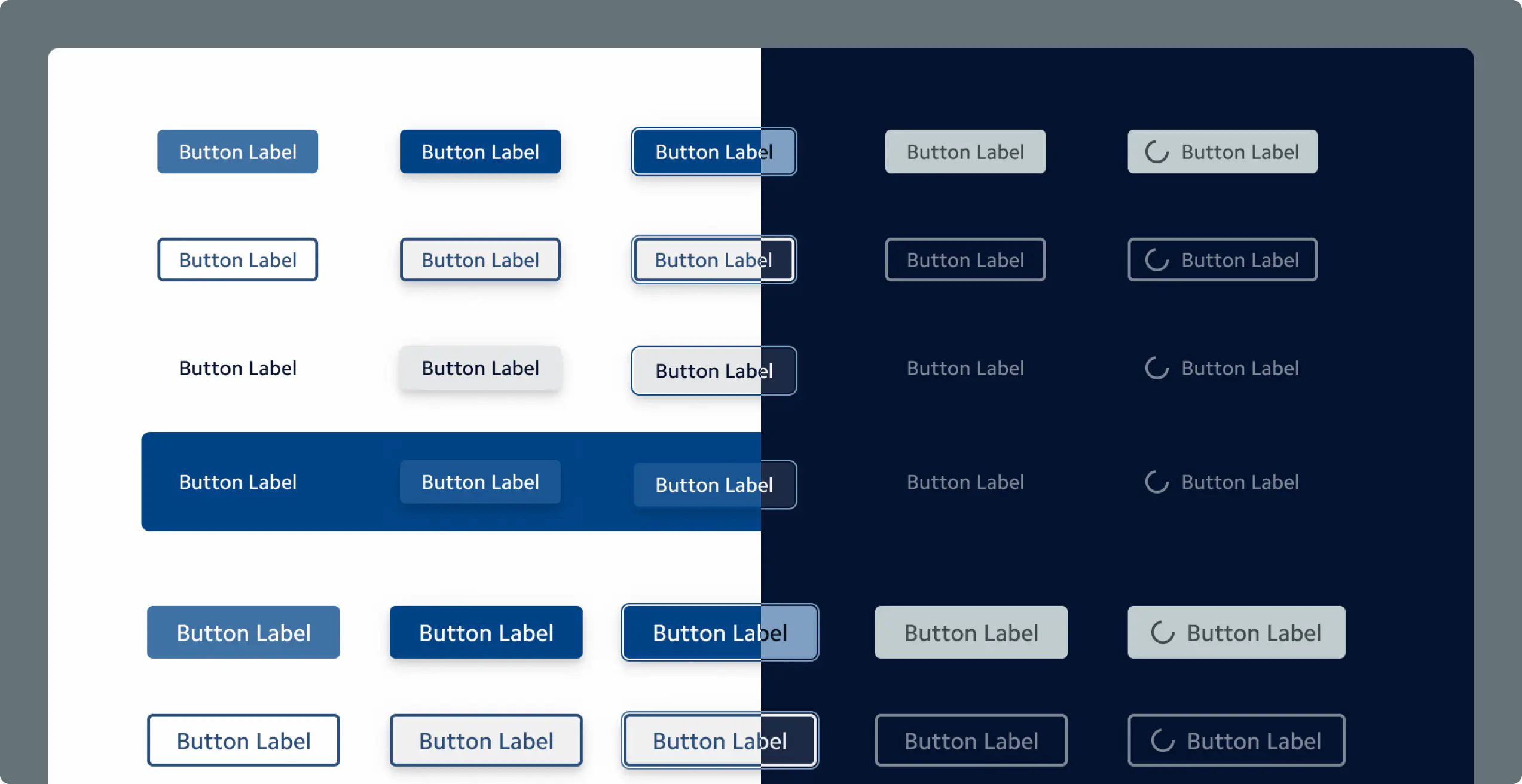
Colour System
I reviewed every brand colour for accessibility (contrast ratios, readability) and expanded the palette with system colours for alerts, statuses, and data visualisations. Both light and dark modes were considered from the start to ensure consistency and legibility.
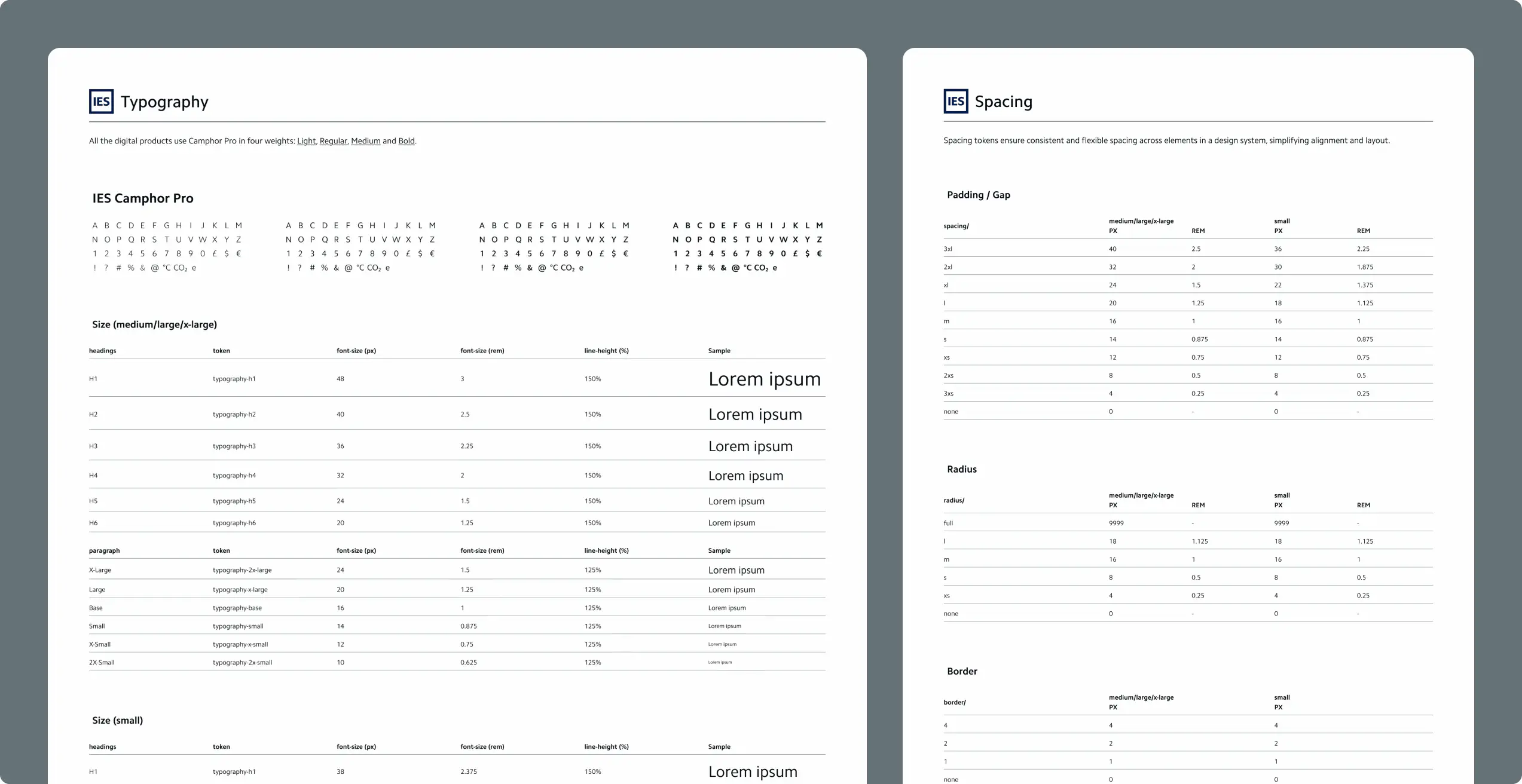
Typography & Spacing
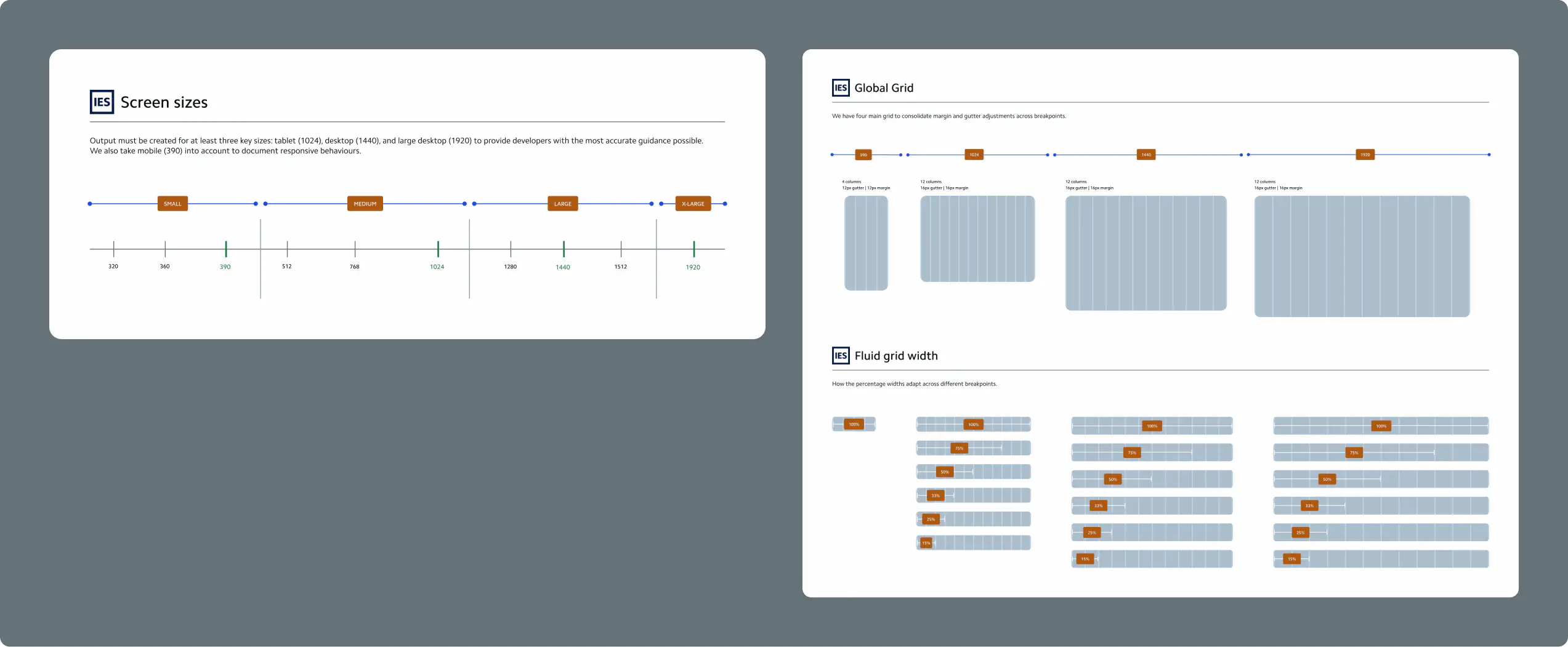
Responsive Framework
Iconography
We decided to integrate an external icon library for consistency and speed. When new icons were needed, I designed them to match the established style and proportions.
Step 2 - Designing the Components
Once the foundation was solid, I moved on to building the components, starting small, then scaling up. Following an atomic design approach, I began with simple elements (buttons, inputs, icons) and worked my way up to more complex structures (cards, modals, tables). To keep everything organised, I designed an overview page inside the design system file - a sort of “control room” where designers could easily navigate between components, see updates, and track changes.
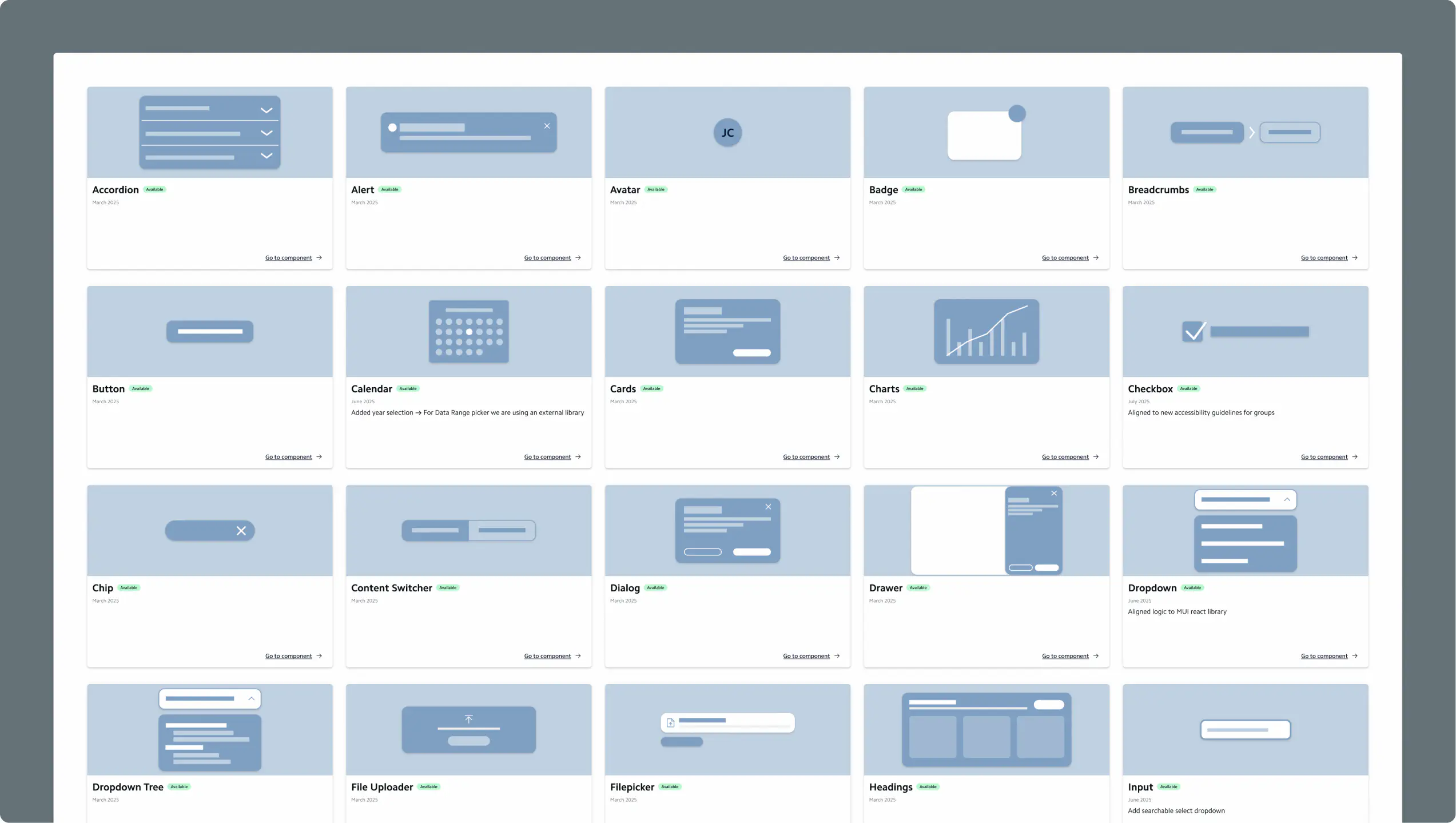
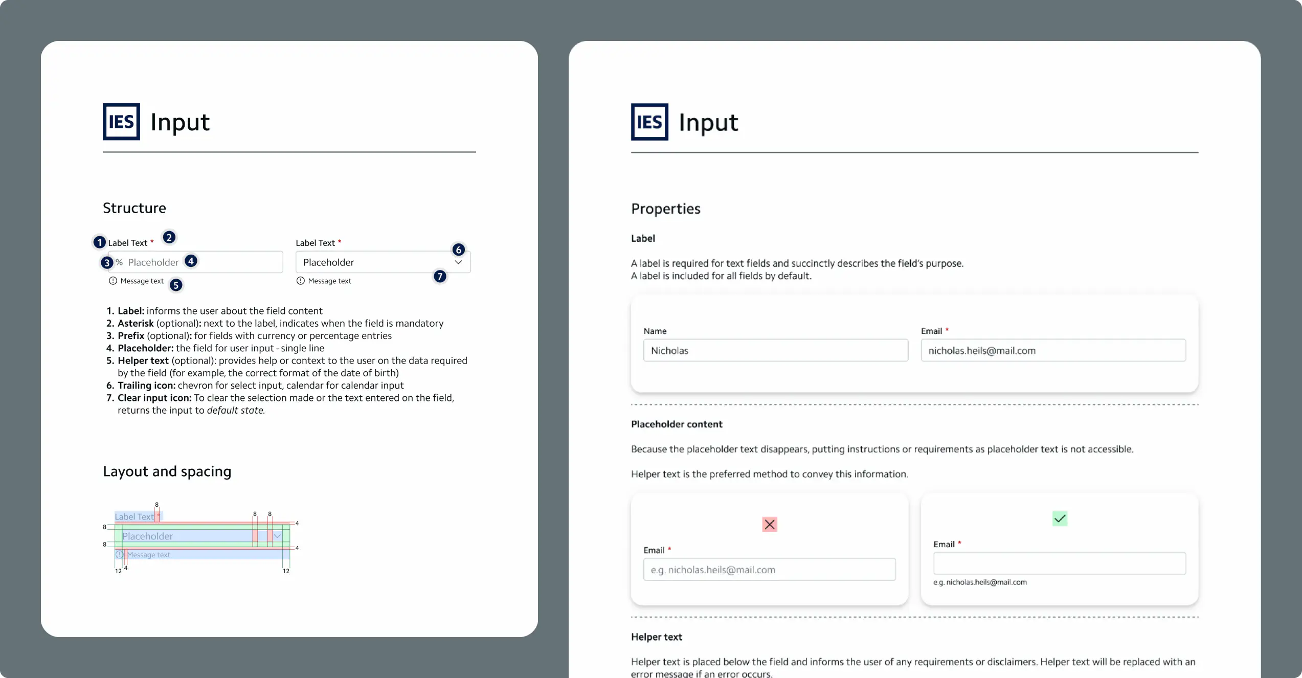
Each component was carefully documented to ensure usability, accessibility, and developer alignment. My documentation process had multiple layers:
- Anatomy: Clear visual breakdown showing structure, spacing, and colour usage.
- Properties & Best Practices: How to use it, available sizes, focus states, and optional elements (like icons or labels).
- Accessibility Guidelines: Detailed notes on keyboard interaction, ARIA roles, and screen reader behaviour.
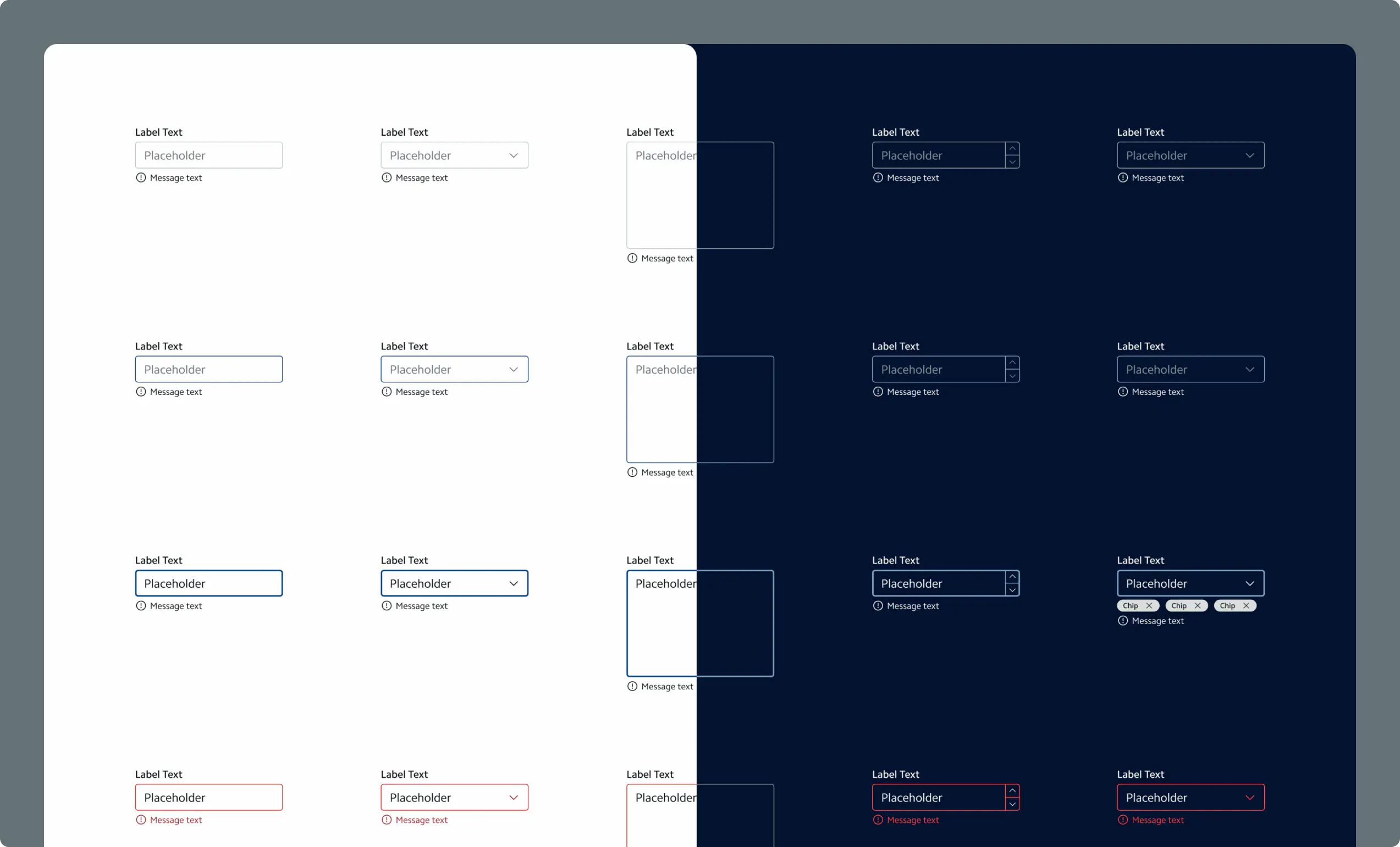
- Component Showcase: All variations and states, ready for handoff.
Step 3 - Creating the Pattern Library
Once the components were in place, I realised something: components alone don’t guarantee consistency - patterns do. So I built a Pattern Library, designed to help designers and developers understand how to use components together in the right way. It’s a guide on UI principles (emphasis, unity, hierarchy, balance, scale, accessibility) and practical design scenarios.
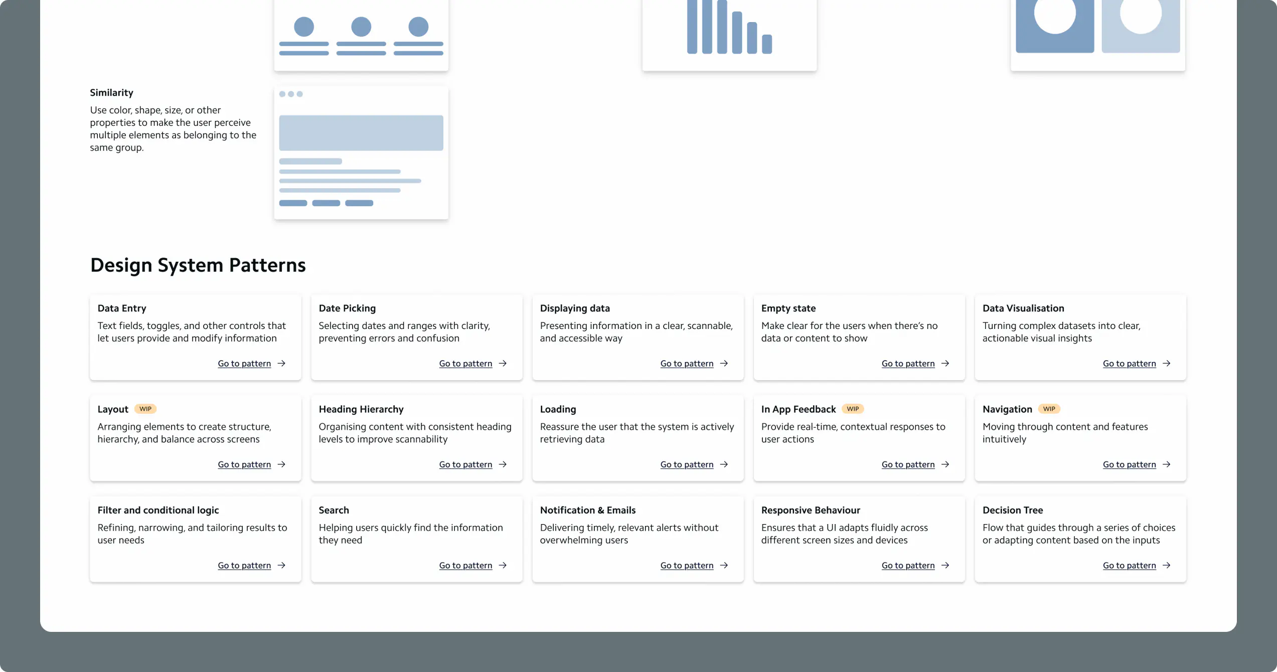
I documented clear, visual patterns for:
- Data Entry: Building accessible, user-friendly forms with clear feedback messages.
- Displaying Data: Presenting information in a clear, scannable format.
- Empty States: Creating friendly, meaningful moments when there’s no data.
- Data Visualisation: Turning complex datasets into simple, actionable visuals.
- Loading States: Reassuring users while data loads.
- Filters & Search: Helping users refine and find what they need quickly.
- Notifications & Emails: Delivering useful alerts that don’t overwhelm.
- Responsive Behaviours: Ensuring layouts stay usable across all screens.
- Navigation: Designing intuitive paths with menus, breadcrumbs, drawers, and dialogs.


Step 4 - Evolving the System
A design system is never finished - it’s a living product. I set up a versioning and update process, where every new component, fix, or improvement is documented in the Figma changelog. This not only keeps the system organised but also helps everyone on the team stay informed and aligned.
The Outcome
The new design system has become much more than a library - it’s a shared language between design, development, and product. It improves speed, consistency, and accessibility, reduces redundant work, and strengthens the connection between our brand and our product experience.